Notebook layout
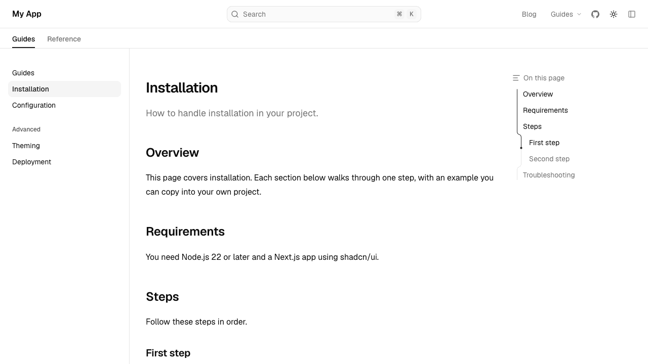
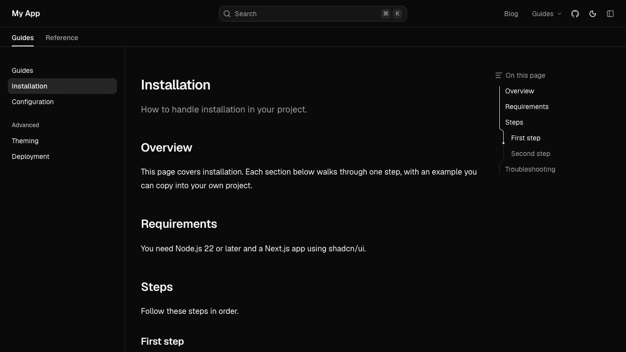
A more compact docs layout, with a navbar beside or above the sidebar.
Installation
npx shadcn@latest add @docscn/notebook-layout @docscn/notebook-pageUsage
The notebook layout has its own DocsLayout and DocsPage. Import both from layouts/notebook:
import { DocsLayout } from "@/components/docs/layouts/notebook";
import { baseOptions } from "@/lib/layout.shared";
import { source } from "@/lib/source";

export default function Layout({ children }: LayoutProps<"/docs">) {
  const base = baseOptions();

  return (
    <DocsLayout
      {...base}
      tree={source.getPageTree()}
      nav={{ ...base.nav, mode: "top" }}
      tabMode="navbar"
    >
      {children}
    </DocsLayout>
  );
}import {
DocsBody,
DocsDescription,
DocsPage,
DocsTitle,
} from "@/components/docs/layouts/notebook/page";The page components take the same props as DocsPage and its companions, so switching layouts means changing layouts/docs to layouts/notebook in both imports.
Like DocsLayout, it's built on the shadcn/ui sidebar, so useSidebar() works inside it. Unlike it, the navbar shows on desktop too, with search, the links and the theme switch. When the sidebar is collapsed, the navbar shows the title and a button to open the sidebar again.
The layout spans the full width of the window, with the sidebar against its edge. Fumadocs UI's notebook layout is centred at up to 97rem wide.
The AI chat panel (aiChat) works as in DocsLayout. With nav.mode: "top", it docks below the navbar.
Props
It takes the same props as DocsLayout, except for the ones below.
Prop
Type
sidebar takes the same options as DocsLayout's, except enabled: the notebook layout always has a sidebar. Search shows in the navbar, not the sidebar.